Pro-Parris Pie Charts
Pie charts present information in the form of a circle divided into segments showing their relative sizes.
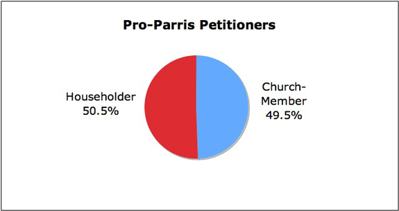
To show the relationship between pro-Parris loyalists who were "Householders" compared to "Church-Members," use the data in the pro-Parris pivot table. Open the Chart Wizard and choose "Pie." Click the "Data Range" icon and drag the mouse through the "Church-Member" and "Householder" labels in the second row of the pivot table. Release the mouse, and hold down the Command key and drag through the two "Grand Total" data cells for "Church-Member" and "Householder" in the fifth row. Release the mouse, and click the "Data Range" box to return to the Chart Wizard window. The "Rows" button should be selected, indicating "series in" rows. Click "Next" and edit the chart in the Chart Options window. Further editing can be made in the final chart image by right-clicking the labels and selecting "Format Data Labels." Users can also construct a pie chart comparing male and female signers of the pro-Parris petition.
In addition, pie charts can show more than two categories. To construct a pie chart displaying the relative size of the four categories of pro-Parris petitioners, create a new worksheet in Excel. In the top row of cells, identify the four groups of pro-Parris supporters (Female Householders, Female Church-Members, Male Householders, and Male Church-Members). In the second row, copy the number of signers in each group from the pro-Parris pivot table.
| F Church-Member | M Church-Member | F Householder | M Householder |
| 27 | 25 | 24 | 29 |
Drag through the cells to select them and open the Chart Wizard. Choose "Pie" and the two rows of cells are identified in the "Data Range" window. The Rows button must be selected, indicating "series in" rows. The pie chart can be edited in the Chart Options window and in the completed chart by right-clicking the labels and selecting "Format Data Labels."
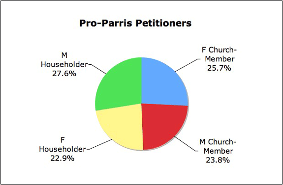
The chart clearly represents the relative sizes of the different pro-Parris groups, with male householders the largest, followed by female church members. At the same time, it visually conveys the notion that Parris had almost equal support among men and women, householders and church members.
To return to the Pro-Parris Social Characteristics page, click Back or Next.